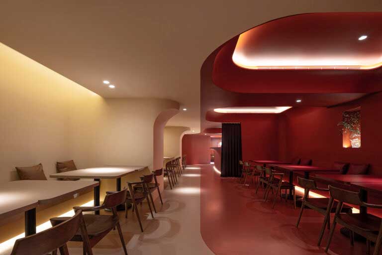
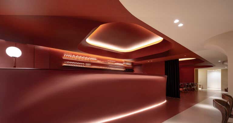
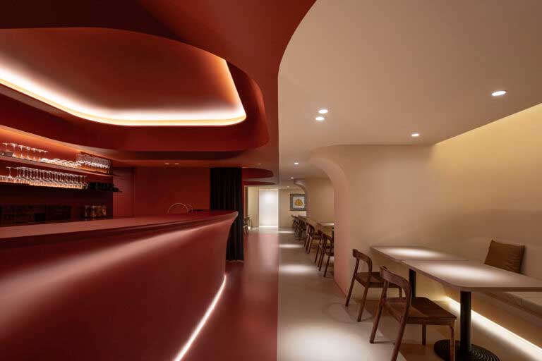
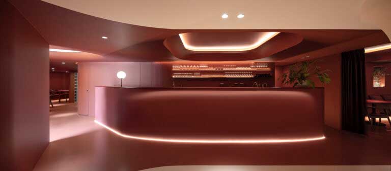
Through the electronic version of Frame, a publication specialized in interior design based in Amsterdam, Netherlands, we learnt about the project we are sharing on this occasion, for which there is hardly any documentation and which would probably go unnoticed if it were not for it. This is the interior architecture of a humble restaurant located in the city of Taipei, Taiwan, the work of local studio Design Apartment. With it we understand how a minimalist interior design based on the enveloping use of colour creates “a mysterious and pure ambiance.”
The interior of the Sung Daan Taipei restaurant responds to the declaration of intent of its designers, when they assure that they apply “professional and rigorous fine engineering” in the service of “pleasant temperature, flowing sound and light, and floating air”, with the ultimate goal of “general visual and chromatic spatial comfort.” Indeed, the interior design of Sung Daan Taipei exemplifies those words wonderfully. More specifically, the creators of Design Apartment assure that their “design philosophy” for this project is inspired by the work of Luis Barragán, the famous Mexican architect, with simple “geometric forms without elaborate embellishments.” That is precisely what his minimalism would consist of.
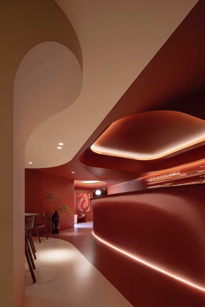
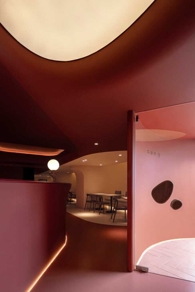
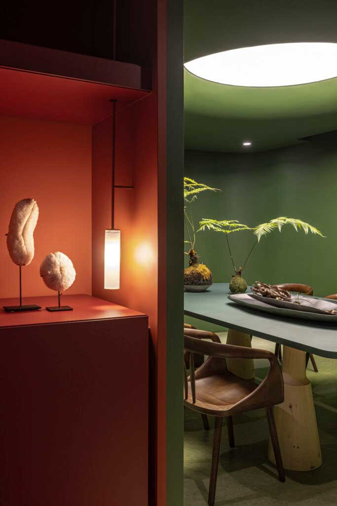
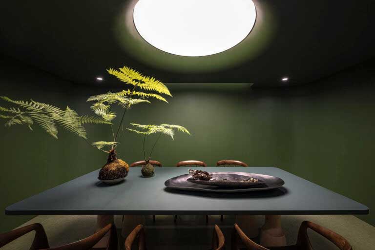
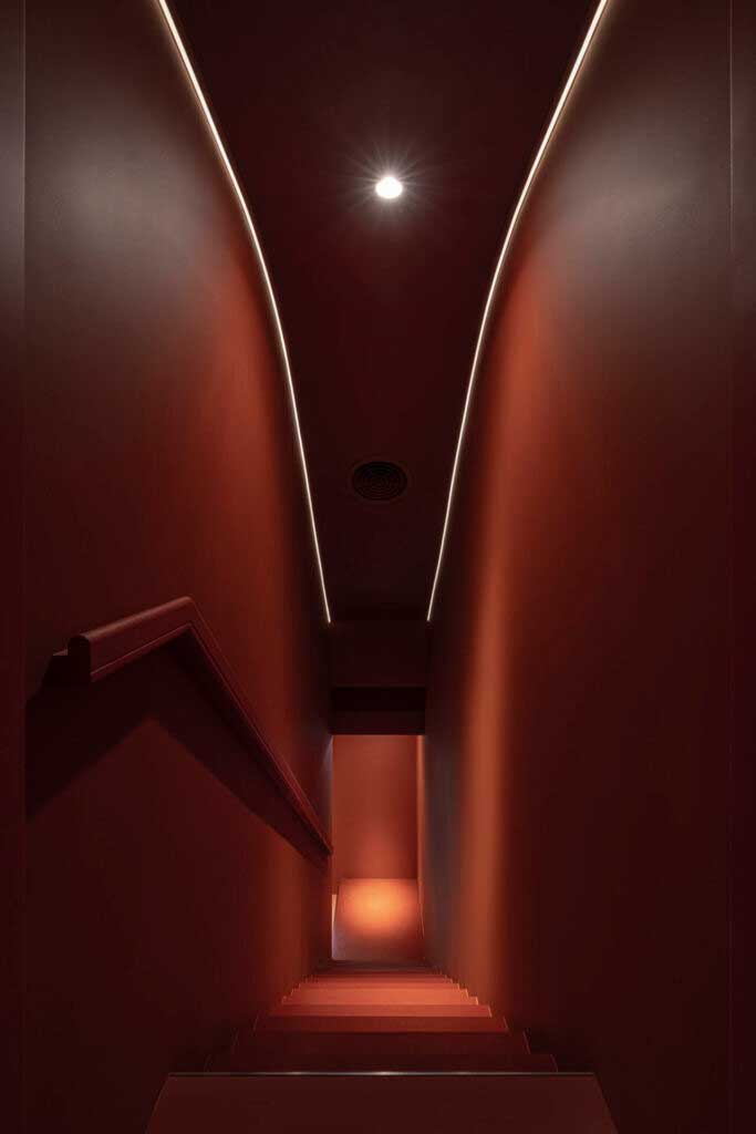
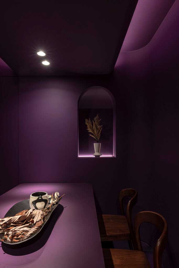
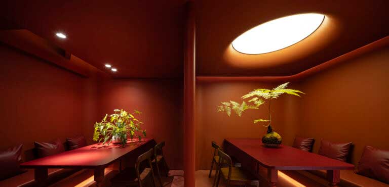
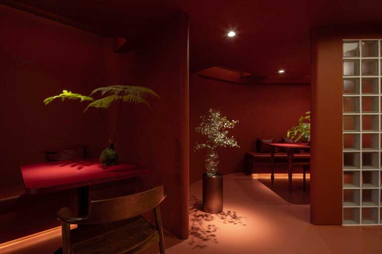
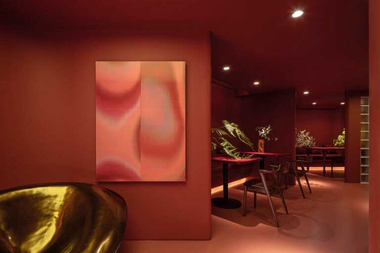
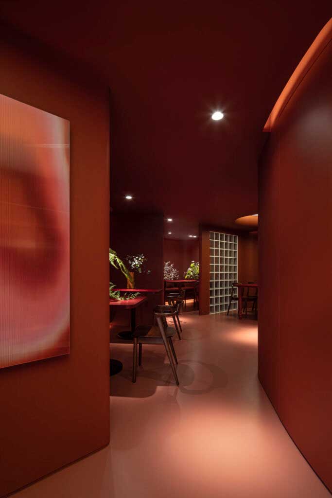
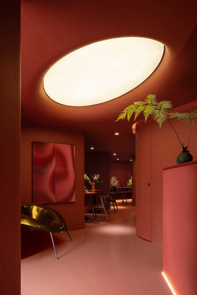
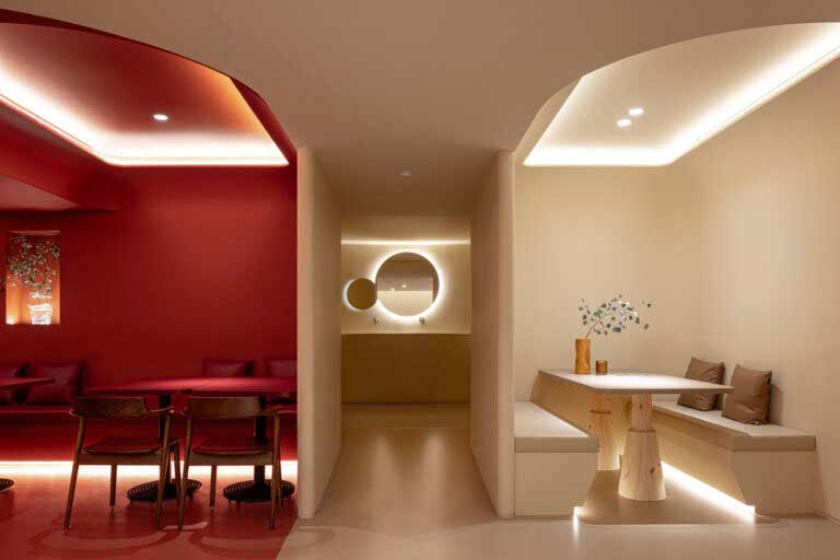
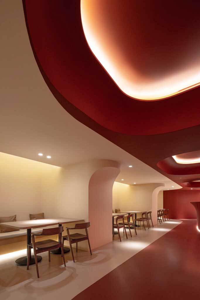
The use of monochrome colours in an extensive way, or perhaps it would be better to say intensive, or in both ways at the same time, from the floor, throughout the surface, to the ceiling, draws powerful attention. In the interior design of the Sung Daan Taipei restaurant, the colours define the space and not vice versa. In a kind of secret code, the separation of areas enters through the eyes unequivocally, without words, without the need for further explanation, just by looking. But also, the space becomes an enveloping, contagious skin. As the designers of Design Apartment put it, the “continuous cave-like design”, “the monochromatic colour palette”, the “irregular curved surfaces”, everything leads to creating the feeling of being in a cave, a grotto of wonders where life it seems to be simplified, reduced to pure elements.
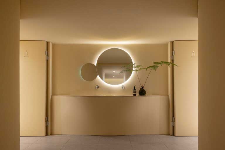
The soft lighting contributes almost inadvertently to defining the contours and enhancing the space without stealing the colour’s prominence. Orange-red and off-white fill the ground floor, whilst a deep, mysterious purple spills into the private cabins on the first floor; In the basement it is the saturated green that gives character to the space. A space in which harmony and sobriety materialize, and which seems capable of transforming those who experience it. Bravo.
Source: Frame. Images: Design Apartment.


