The design of spaces – theme parks in this case – has a psychological aspect, as it employs a language, that of shapes, textures and colours, which appeals directly to the emotions. Therefore, sinuous lines and organic structures convey a sense of fluidity, warmth and harmony, while angular geometries and straight, precise lines express clarity and order, if not coldness and impiety. Theme parks often employ these principles of psychology to envelop us in impossible architectures and imaginative volumes that awaken our wonder.
Colour is precisely one of the accents that the language of design relies on in its sensory narrative. The chromatic palette not only defines ambiences, but also modulates our mood. Intense reds and vibrant oranges in areas of high activity stimulate the secretion of adrenaline, while deep blues and soft greens transport us to oases of tranquillity. Sometimes the strategic determination of colour even alters our spatial and temporal perception, whether we are in the darkness of a tunnel or under the flood of light in an open plaza.
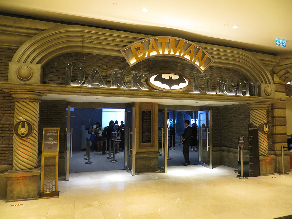
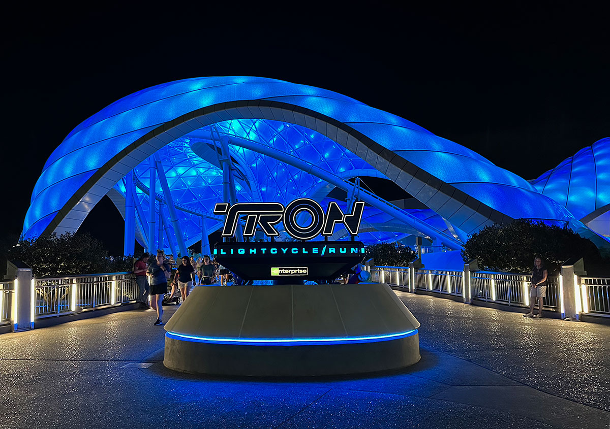
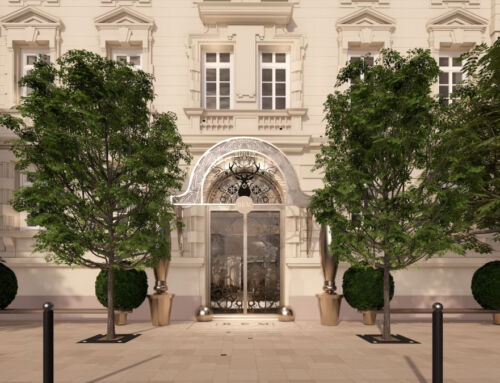
Paradigmatic examples of this are the Tron Light Cycle Run, with its sinuous architecture and neon lights, suggesting a futuristic atmosphere. In Batman Dark Flight’s gothic entrance, on the other hand, darkness contrasts with gold to infect the passer-by with mystery. In this way, each design reinforces a specific emotional narrative.
By Manuel Ginés, Senior Architect in Amusement Logic’s Architecture Dept.


