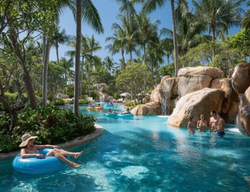
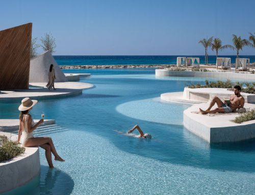
Colours represent the terms of a universal language that forms a fundamental part of the expressiveness of architecture. It has the power to evoke emotions, influence perception and enrich visitors’ experience. At Amusement Logic’s Design Department we use this universal language, colour, to create unique and expressive environments.
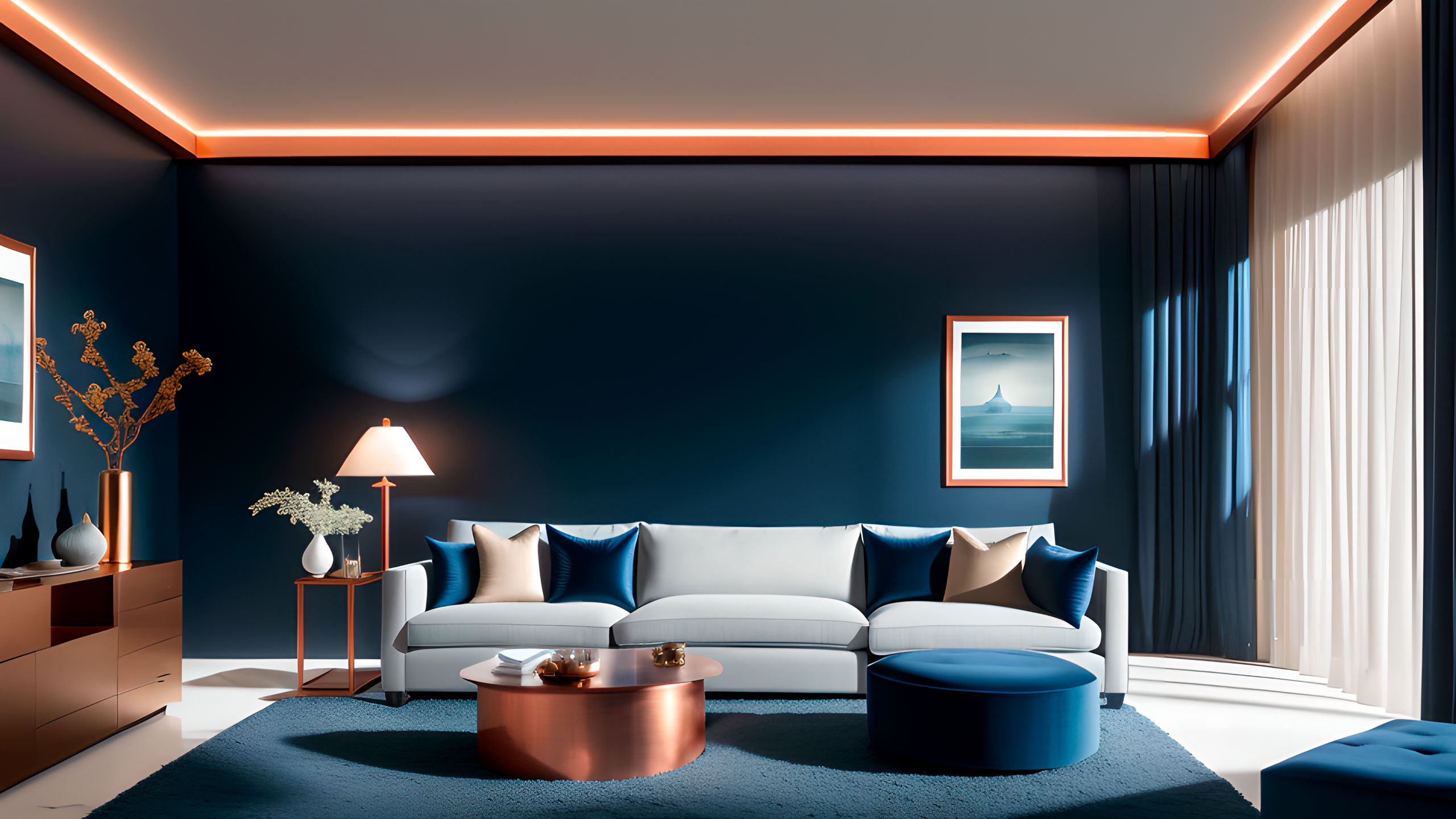
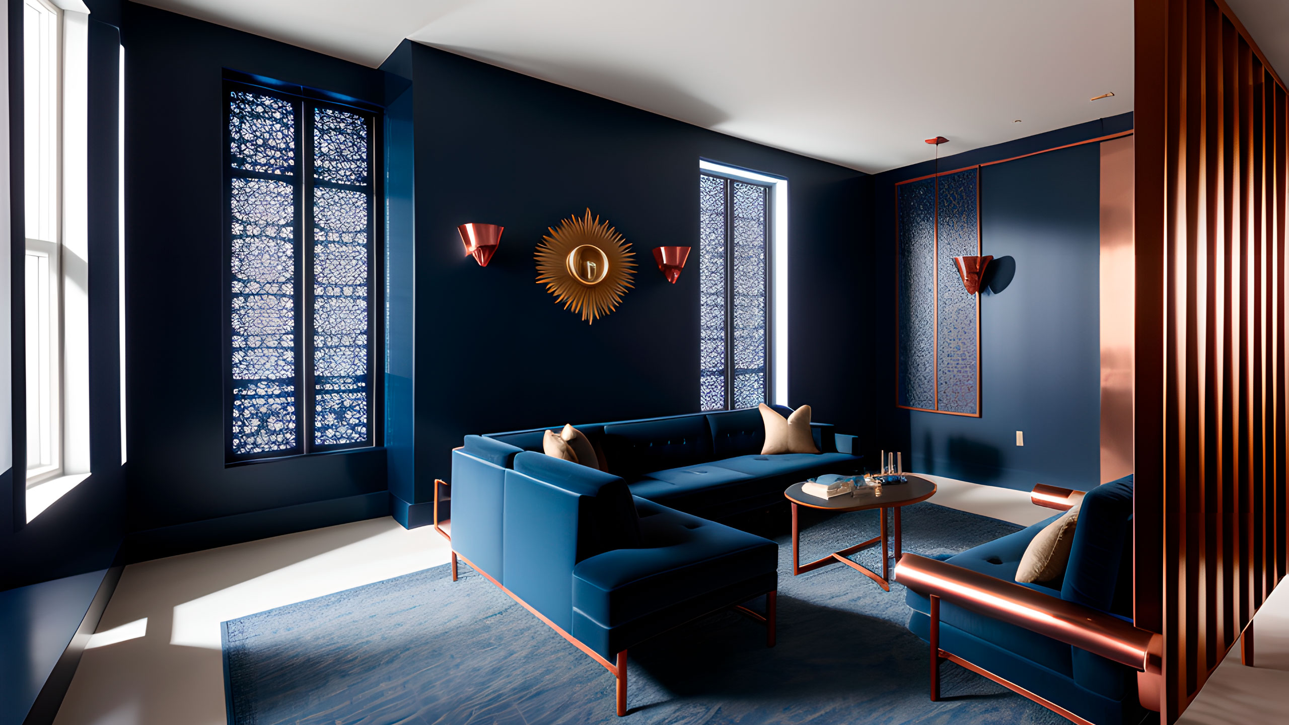
An example of the efficient use of the multiple expressive possibilities of colour is a new interior design project, for which we have created several spaces. We used a deep blue in combination with copper details. Blue, known to instil a sense of tranquillity and peace in people, is the dominant tone. The copper details, on the other hand, provide a contrast that is at once unusual and sophisticated. The result is a refined ambience, perfect for an intimate dinner or a quiet meeting.
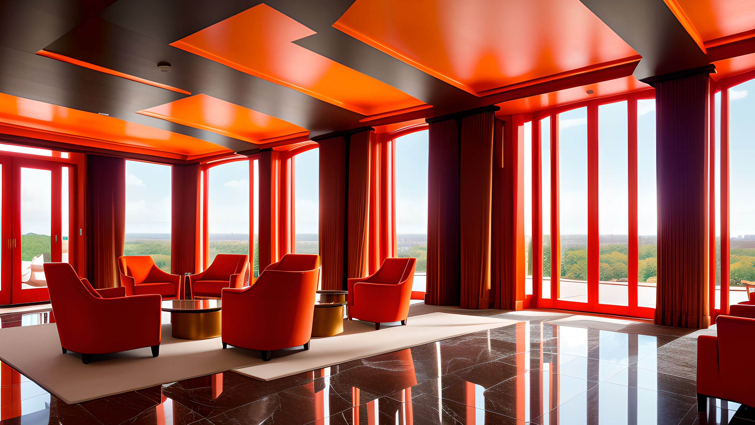
Warm colours such as orange or red, on the other hand, have a completely different effect. In the design of a hotel lobby we use these shades to offer an immediate sense of warmth, a perfect welcome. These vibrant, lively and energetic colours invite guests to be active and enjoy the time they will spend within the hotel premises.
As we can see in our designs, beyond its aesthetic aspect, colour is a powerful tool. With a significant impact on the overall ambience, it helps to define the personality of a building’s spaces and shape guest experience. At Amusement Logic’s Design Department we are aware of the influence of colour in architecture. That’s why we use it effectively to create spaces that are not only visually appealing, but which also convey emotions and enrich guests’ stay.


