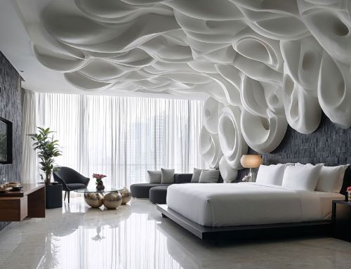
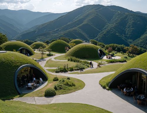
Amusement Logic’s Design Department proposes an interior design concept for a children’s shop. Its design does not merely seek to fulfil its purpose as a commercial space, but tries to convey an emotion, in this case joy, and to define an incitement, in other words, kids’ curiosity. At the same time, the space should embrace adults with a serene and pleasant shopping experience.
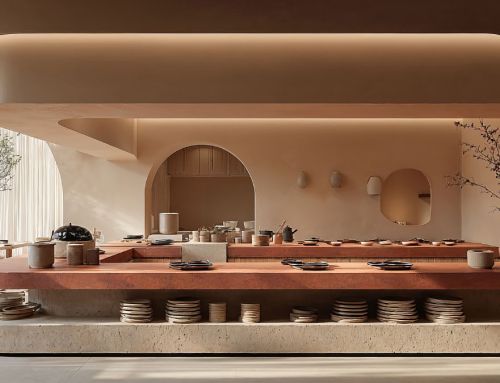
Through soft shapes, pastel colours and warm lighting, the interior design of this shop exudes a golden sense of wonder and enchantment. The unconventional display structures represent small nooks and crannies for discovery, instead of simple shelves and tables. In this way, a fantasy landscape stimulates children’s imagination and makes the relationship with the products an almost adventurous experience.
The earthy tones of the colours contribute to serenity and concentration, while soft accents encourage surprise and fun. The furniture features organic shapes and the interior design elements, beyond their visual appeal, are accessible and safe for children. Nothing will prevent them from freely exploring and interacting with the items at hand.

The interior design of this shop also integrates lighting technology. In addition to highlighting the products, the lights change softly throughout the day and adapt to the different moods of the children and their families. This concept presented by Amusement Logic’s Design Department goes beyond functionality to capture the essence of a children’s shop: a place of discovery, learning and fun, a memorable place for both children and their parents.


