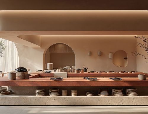
Amusement Logic’s Design Department presents a vibrant new interior design for a restaurant that will surprise diners and attract the gaze of those who pass by its windows. Organic circular shapes, vaguely reminiscent of a cephalopod, and a tricolour palette of deep red, nuclear white and touches of deep black, result in a bold and provocative ambience.
The red walls contrast with the white, tempered only by the petrol black of the floor. The coherence of this restaurant’s interior design extends to the seating. Each chair and stool becomes an integral part of the overall experience, in continuity with the design of the entire space.
The sinuous silhouettes, every curve and contour, the vibrancy of the colour, all contribute to a visual narrative that suggests adventure, passion, even a kind of unbridled fun, according to different versions that adapt to the different areas of the restaurant.


By Rebeca Pérez, designer in Amusement Logic’s Design Dept.


