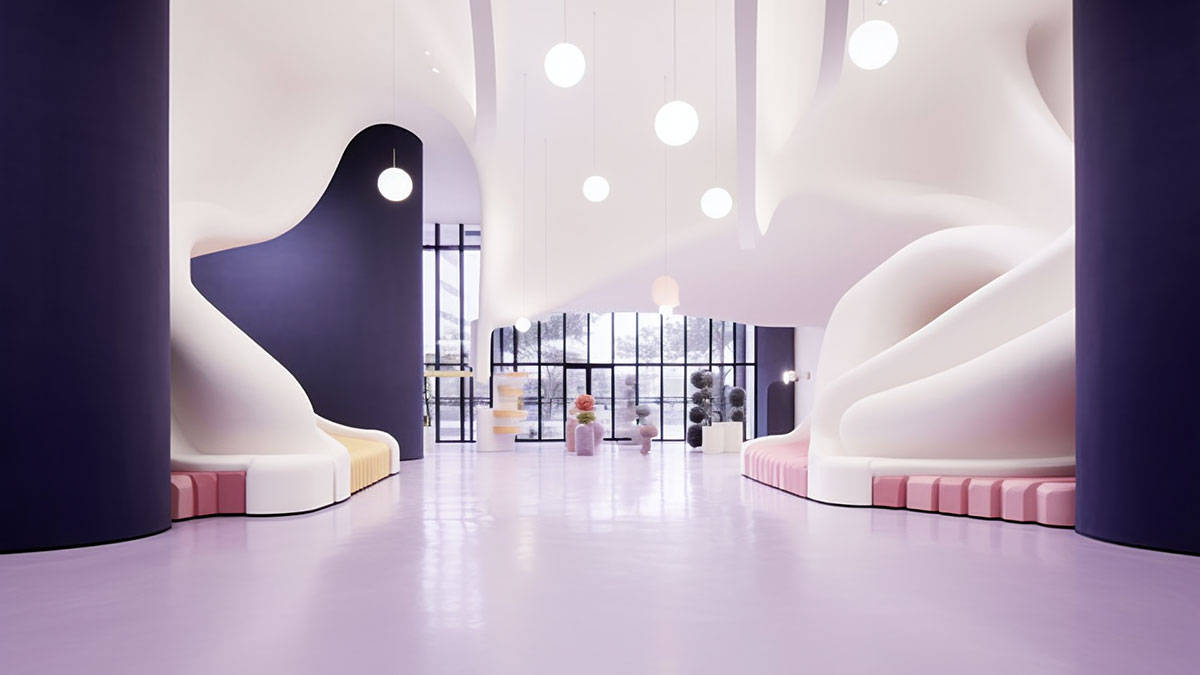
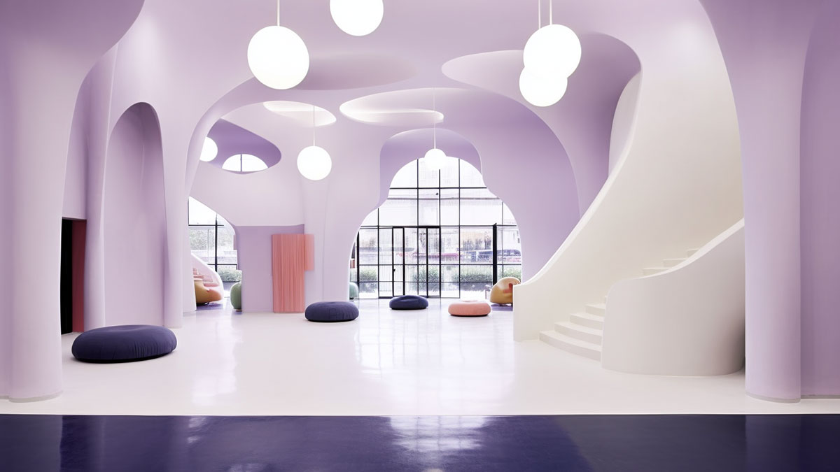
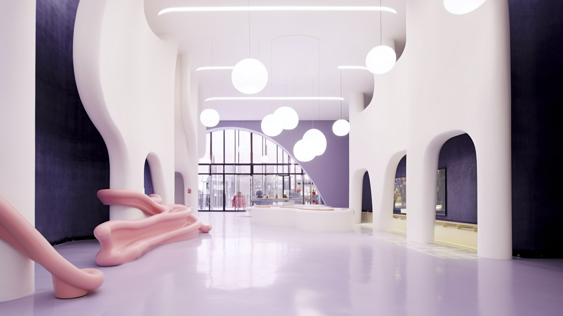
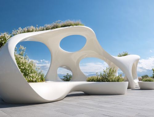
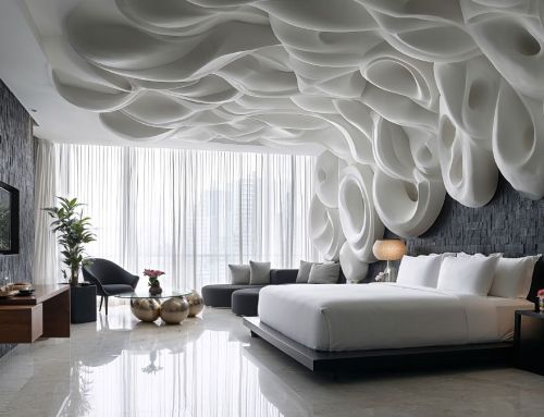
Commercial spaces should not only be functional, but should also reflect the brand identity and transmit a clear philosophy. The interior design project presented by Amusement Logic’s Design Department is a demonstration of this criterion. Upon entering the space we have created, visitors are greeted by an interior design that radiates freshness, modernity and originality, fundamental characteristics in today’s youth market.
The curved shapes bring fluidity to a space in which pastel colours are combined, with a predominance of white. The decision to use these design resources is not arbitrary: the curves create an organic feeling of welcome, almost like an embrace, while the pastel shades, especially white, bring light and spaciousness. This combination, which is aligned with the brand’s corporate image, optimises the customer experience at the same time. Therefore, the customer’s vision is combined with Amusement Logic’s experience. In this case, we translate a fresh and casual corporate identity into a tangible and coherent spatial design.
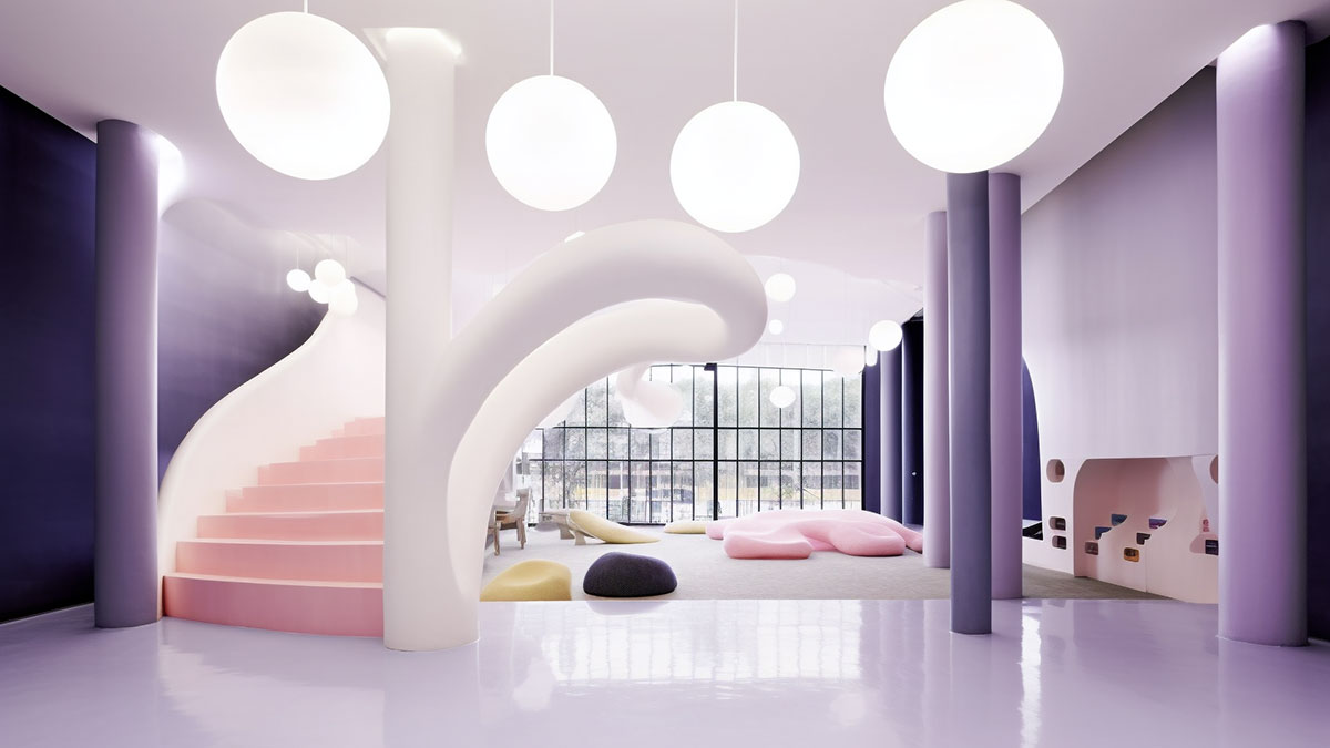
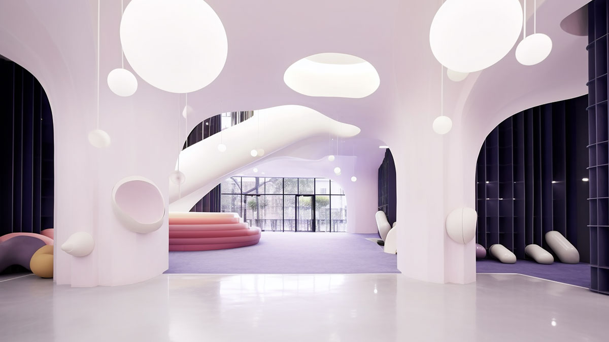
Flexibility is another central pillar of our interior design methodology. We know that the world of commerce is constantly evolving and that spaces need to adapt over time to its transformations. For this reason, our designs always seek versatility as well as clear appeal. With it, we make it possible to reconfigure and adjust spaces in the future, without compromising either aesthetics or functionality. The interior design project for this chain of shops is a clear example of Amusement Logic’s commitment to design excellence, adaptability and compliance with local regulations.
